Preview Extract
______________________________________________
Chapter 2: Economic Theories, Data, and Graphs
______________________________________________
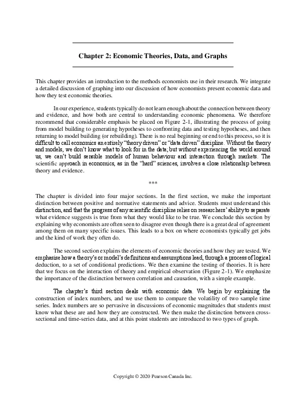
This chapter provides an introduction to the methods economists use in their research. We integrate
a detailed discussion of graphing into our discussion of how economists present economic data and
how they test economic theories.
In our experience, students typically do not learn enough about the connection between theory
and evidence, and how both are central to understanding economic phenomena. We therefore
recommend that considerable emphasis be placed on Figure 2-1, illustrating the process of going
from model building to generating hypotheses to confronting data and testing hypotheses, and then
returning to model building (or rebuilding). There is no real beginning or end to this process, so it is
difficult to call economics an entirely โtheory drivenโ or โdata drivenโ discipline. Without the theory
and models, we donโt know what to look for in the data; but without experiencing the world around
us, we canโt build sensible models of human behaviour and interaction through markets. The
scientific approach in economics, as in the โhardโ sciences, involves a close relationship between
theory and evidence.
***
The chapter is divided into four major sections. In the first section, we make the important
distinction between positive and normative statements and advice. Students must understand this
distinction, and that the progress of any scientific discipline relies on researchersโ ability to separate
what evidence suggests is true from what they would like to be true. We conclude this section by
explaining why economists are often seen to disagree even though there is a great deal of agreement
among them on many specific issues. This leads to a box on where economists typically get jobs
and the kind of work they often do.
The second section explains the elements of economic theories and how they are tested. We
emphasise how a theoryโs or modelโs definitions and assumptions lead, through a process of logical
deduction, to a set of conditional predictions. We then examine the testing of theories. It is here
that we focus on the interaction of theory and empirical observation (Figure 2-1). We emphasize
the importance of the distinction between correlation and causation, with a simple example.
The chapterโs third section deals with economic data. We begin by explaining the
construction of index numbers, and we use them to compare the volatility of two sample time
series. Index numbers are so pervasive in discussions of economic magnitudes that students must
know what these are and how they are constructed. We then make the distinction between crosssectional and time-series data, and at this point students are introduced to two types of graph.
Copyright ยฉ 2020 Pearson Canada Inc.
14 Instructorโs Manual for Ragan, Economics, Sixteenth Canadian Edition
This brings us to the chapterโs final section, on graphing. We show how a relation can be
expressed in words, in a table, in an equation, or on a graph. We then go into considerable detail
on linear functions, slope, non-linear functions, and functions with minima and maxima. In this
discussion, the student is introduced to the concept of the margin, described as the change in Y in
response to a one-unit change in X. In all cases, the graphs apply to real-world situations rather
than abstract variables. Pollution abatement, hockey-stick production, firm profits, and fuel
consumption are our main examples.
Answers to Study Exercises
Fill-in-the-Blank Questions
Question 1
a) models (or theories)
b) endogenous; exogenous
c) (conditional) prediction; empirical
d) (positively) correlated; causal
e) self-interest; utility; profits
Question 2
a) index; relative
b) absolute value of the price; absolute value of the price
c) cross-section
d) scatter
e) time-series
Copyright ยฉ 2020 Pearson Canada Inc.
Chapter 2: Economic Theories, Data, and Graphs 15
Question 3
a) ๏Y/๏X
b) 500; positively; 4
c) 12; negatively; -0.2
d) tangent
e) zero; zero
Review Questions
Question 4
a) normative (โThe government should imposeโฆโ is inherently a value judgement.)
b) positive (In principle, we could determine the impact that foreign aid actually has.)
c) positive (In principle, we could determine the extent to which fee increases affect access.)
d) normative (What is or is not unfair is clearly based on a value judgement.)
e) normative (Use of the expression โtoo muchโ is a value judgement.)
Question 5
a) In the Canadian wheat sector, the amount of rainfall on the Canadian prairies is an exogenous
variable; the amount of wheat produced is an endogenous variable.
b) To the Canadian market for coffee, the world price of coffee is exogenous; the price of a cup of
coffee at Tim Hortonโs is endogenous.
c) To any individual student, the widespread unavailability of student loans is exogenous; their
own attendance at university or college is endogenous.
d) To any individual driver, the tax on gasoline is exogenous; his or her own decision regarding
which vehicle to purchase is endogenous.
Question 6
The observed correlation cannot lead to a certain inference about causality. It is consistent with
the theory that the increase in demand for homes leads to an increase in the price of lumber
(which is generally a pretty sensible theory!), but it is also consistent with a different theory โ one
in which some unobserved factor leads to both the increase in demand for homes and separately
to the increase in the price of lumber. Correlation does not imply causality!
Copyright ยฉ 2020 Pearson Canada Inc.
16 Instructorโs Manual for Ragan, Economics, Sixteenth Canadian Edition
Problems
Question 7
a) Using 2009 as the base year means that we choose $85 as the base price. We thus divide the
actual prices in all years by $85 and then multiply by 100. In this way, we will determine, in
percentage terms, how prices in other years differ from prices in 2009. The index values are as
follows:
Year
Price ($)
Physics textbook price index
2009
2010
2011
2012
2013
2014
2015
2016
2017
2018
2019
85
87
94
104
110
112
120
125
127
127
130
(85/85) ๏ด 100 = 100
(87/85) ๏ด 100 = 102.4
(94/85) ๏ด 100 = 110.6
(104/85) ๏ด 100 = 122.4
(110/85) ๏ด 100 = 129.4
(112/85) ๏ด 100 = 131.8
(120/85) ๏ด 100 = 141.2
(125/85) ๏ด 100 = 147.1
(127/85) ๏ด 100 = 149.4
(130/85) ร 100 = 152.9
b) The price index in 2014 is 131.8, meaning that the price of the physics textbook is 31.8 percent
higher in 2014 than in the base year, 2009.
c) From 2016 to 2019, the price index increases from 147.1 to 152.9โฏbut this is not an increase of
5.8 percent. The percentage increase in the price index from 2016 to 2019 is equal to [(152.9147.1)/147.1]ร100 = 3.94 percent.
d) These are time-series data because the data are for the same product at the same place but at
different points in time.
Question 8
a) Using Calgary as the โbase universityโ means that we choose $6.25 as the base price. Thus we
divide all actual prices by $6.25 and then multiply by 100. In this way, we will determine, in
percentage terms, how prices at other universities differ from Calgary prices. The index values are
as follows:
Copyright ยฉ 2020 Pearson Canada Inc.
Chapter 2: Economic Theories, Data, and Graphs 17
University
Price per pizza
Index of pizza prices
Dalhousie
Laval
McGill
Queenโs
Waterloo
Manitoba
Saskatchewan
Calgary
UBC
Victoria
$6.50
5.95
6.00
8.00
7.50
5.50
5.75
6.25
7.25
7.00
(6.50/6.25)๏ด100 = 104
(5.95/6.25)๏ด100 = 95.2
(6.00/6.25)๏ด100 = 96
(8.00/6.25)๏ด100 = 128
(7.50/6.25)๏ด100 = 120
(5.50/6.25)๏ด100 = 88
(5.75/6.25)๏ด100 = 92
(6.25/6.25)๏ด100 = 100
(7.25/6.25)๏ด100 = 116
(7.00/6.25)๏ด100 = 112
b) The university with the most expensive pizza is Queenโs, at $8.00 per pizza. The index value for
Queenโs is 128, indicating that pizza there is 28 percent more expensive than at Calgary.
c) The university with the least expensive pizza is Manitoba, at $5.50 per pizza. The index value
for Manitoba is 88, indicating that the price of pizza there is only 88 percent of the price at Calgary.
It is therefore 12 percent cheaper than at Calgary.
d) These are cross-sectional data. The variable is the price of pizza, collected at different places at
a given point in time (March 1, 2016). If the data had been the prices of pizza at a single university
at various points in time, they would be time-series data.
Question 9
a) Using 2012 as the base year for an index number requires that we divide the value of exports
(and imports) in each year by the value in 2012, and then multiply the result by 100. This is done
in the table below.
Year
2012
2013
2014
2015
2016
Exports
11225
11687
11821
12219
12507
Export Index
(11225/11225)(100) = 100
(11687/11225)(100) = 104.1
(11821/11225)(100) = 105.3
(12219/11225)(100) = 108.9
(12507/11225)(100) = 111.4
Imports
3706
3550
3262
3447
3659
Import Index
(3706/3706)(100) = 100
(3550/3706)(100) = 95.8
(3262/3706)(100) = 88.0
(3447/3706)(100) = 93.0
(3659/3706)(100) = 98.7
b) It appears that imports were more volatile over this period than exports. Imports fell by about
12 percent in the first two years, and then increased by about 10 percent in the next two. In contrast,
exports increased fairly steadily, by a total of over 11 percent over the five years.
Copyright ยฉ 2020 Pearson Canada Inc.
18 Instructorโs Manual for Ragan, Economics, Sixteenth Canadian Edition
c) From 2014 to 2016, the export index increases from 105.3 to 111.4. The percentage change is
equal to (111.4 โ 105.3)/105.3 which is 5.8 percent. For imports the percentage change is (98.7 88.0)/88.0 which is 12.2 percent.
Question 10
This is a good question to make sure students understand the importance of using weighted
averages rather than simple averages in some situations.
a) The simple average of the three regional unemployment rates is equal to (5.5 + 7.2 + 12.5)/3 =
8.4. Is 8.4% the โrightโ unemployment rate for the country as a whole? The answer is no because
this simple, unweighted (or, more correctly, equally weighted) average does not account for the
fact that the Centre is much larger in terms of the labour force than either the West or East, and
thus should be given more weight than the other two regions.
b) To solve this problem, we construct a weighted average unemployment rate. We do so by
constructing a weight for each region equal to that regionโs share in the total labour force. From
the data provided, the countryโs total labour force is 17.2 million (5.3 + 8.4 + 3.5). The three
weights are therefore:
West: weight = 5.3/17.2 = 0.308
Centre: weight = 8.4/17.2 = 0.488
East:
weight = 3.5/17.2 = 0.203
These weights should sum exactly to 1.0, but due to rounding they do not quite do so. Using
these weights, we now construct the average unemployment rate as the weighted sum of the three
regional unemployment rates.
Canadian weighted unemployment rate = (.308 ๏ด 5.5) + (.488 ๏ด 7.2) + (.203 ๏ด 12.5) = 7.75
This is a better measure of the Canadian unemployment rate because it correctly weights each
regionโs influence in the national total. Keep in mind, however, that for many situations the relevant
unemployment rate for an individual or a firm may be the more local one rather than the national
average.
Question 11
a) These data are best illustrated with a time-series graph, with the month shown on the horizontal
axis and the exchange rate shown on the vertical axis.
Copyright ยฉ 2020 Pearson Canada Inc.
Chapter 2: Economic Theories, Data, and Graphs 19
b) These cross-sectional data are best illustrated with a bar chart.
c) These cross-sectional data are best illustrated in a scatter diagram; the โline of best fitโ is clearly
upward sloping, indicating a positive relationship between average investment rates and average
growth rates.
Copyright ยฉ 2020 Pearson Canada Inc.
20 Instructorโs Manual for Ragan, Economics, Sixteenth Canadian Edition
Question 12
a) Along Line A, Y falls as X rises; thus the slope of Line A is negative. For Line B, the value of Y
rises as X rises; thus the slope of Line B is positive.
b) Along Line A, the change in Y is โ4 when the change in X is 6. Thus the slope of Line A is
ฮY/ฮX = -4/6 = -2/3. The equation for Line A is:
Y = 4 โ (2/3)X
c) Along Line B, the change in Y is 7 when the change in X is 6. Thus the slope of Line B is ฮY/ฮX
= 7/6. The equation for Line B is:
Y = 0 + (7/6)X
Question 13
Given the tax-revenue function T = 10 + .25Y, the plotted curve will have a vertical intercept of 10
and a slope of 0.25. The interpretation is that when Y is zero, tax revenue will be $10 billion. And
for every increase in Y of $100 billion, tax revenue will rise by $25 billion. The diagram is as shown
below:
Copyright ยฉ 2020 Pearson Canada Inc.
Chapter 2: Economic Theories, Data, and Graphs 21
Question 14
a) The slope of the straight line connecting two points is equal to the change in Y between the
points divided by the change in X between the points. In this case, the change in Y from the first
point to the second is 3; the change in X is 9. Thus the slope of the straight line is 3/9 = 1/3.
b) From point A to point B, the change in Y is 20 and the change in X is -10. Thus the slope of the
straight line is -20/10 = -2.
c) The slope of the function is the change in Y brought about by a one-unit change in X, which is
given by the coefficient on X, -0.5.
d) The slope of the function is the change in Y brought about by a one-unit change in X, which is
given by the coefficient on X, 6.5.
e) The slope of the function is the change in Y brought about by a one-unit change in X, which is
given by the coefficient on X, 3.2.
f) The Y intercept of a function is the value of Y when X equals 0. In this case the Y intercept is
1000.
g) The Y intercept of a function is the value of Y when X equals 0. In this case the Y intercept is 100.
h) The X intercept of a function (if it exists) is the value of X when Y equals 0. In this case, when
Y equals 0 we have the equation 0 = 10 โ 0.1X which yields -10 = -0.1X which gives us X = 100.
Copyright ยฉ 2020 Pearson Canada Inc.
22 Instructorโs Manual for Ragan, Economics, Sixteenth Canadian Edition
Question 15
Let A be the firmโs annual spending on advertising and let R be the firmโs annual revenues. The
equation for advertising (A) as a function of revenues (R) is A = 100,000 + (0.15)R.
Question 16
a) For each relation, plot the values of Y for each value of X. Construct the following table:
(i) Y = 50 + 2X
(ii) Y = 50 + 2X + .05X2
(iii) Y = 50 + 2X – .05X2
X
Y
X
Y
X
Y
0
10
20
30
40
50
50
70
90
110
130
150
0
10
20
30
40
50
50
75
110
155
210
275
0
10
20
30
40
50
50
65
70
65
50
25
Now plot these values on scale diagrams, as shown below. Notice the different vertical scale on
the three different diagrams.
b) For part (i), the slope is positive and constant and equal to 2. For each 10-unit increase in X,
there is an increase in Y of 20 units. For part (ii), the slope is always positive since an increase in
X always leads to an increase in Y. But the slope is not constant. As the value of X increases, the
slope of the line also increases. For part (iii), the slope is positive at low levels of X. But the function
reaches a maximum at X=20, after which the slope becomes negative. Furthermore, when X is
greater than 20, the slope of the line becomes more negative (steeper) as the value of X increases.
Copyright ยฉ 2020 Pearson Canada Inc.
Chapter 2: Economic Theories, Data, and Graphs 23
c) For part (i), the marginal response of Y to a change in X is constant and equal to 2. This is the
slope of the line. In part (ii), the marginal response of Y to a change in X is always positive, but the
marginal response increases as the value of X increases. This is why the line gets steeper as X
increases. For part (iii), the marginal response of Y to a change in X is positive at low levels of X.
But after X=20, the marginal response becomes negative. Hence the slope of the line switches from
positive to negative. Note that for values of X further away from X=20, the marginal response of Y
to a change in X is larger in absolute value. That is, the curve flattens out as we approach X=20 and
becomes steeper as we move away (in either direction) from X=20.
Question 17
The four scale diagrams are shown on the next page, each with different vertical scales. In each
case, the slope of the line is equal to ๏Y/๏X, which is often referred to as โthe rise over the runโ โ
the amount by which Y changes when X increases by one unit. (For those students who know
calculus, the slope of each curve is also equal to the derivative of Y with respect to X, which for
these curves is given by the coefficient on X in each equation.)
Question 18
The six required diagrams are shown below. Note that we have not provided specific units on the
axes. For the first three figures, the tax system provides good examples. In each case, think of
earned income as being shown along the horizontal axis and taxes paid shown along the vertical
axis. The first diagram might show a progressive income-tax system where the marginal tax rate
rises as income rises. The second diagram shows a proportional system with a constant marginal
tax rate. The third diagram shows marginal tax rates falling as income rises, even though total tax
paid still rises as income rises.
Copyright ยฉ 2020 Pearson Canada Inc.
24 Instructorโs Manual for Ragan, Economics, Sixteenth Canadian Edition
For the second set of three diagrams, imagine the relationship between the number of
rounds of golf played (along the horizontal axis) and the golf score one achieves (along the vertical
axis). In all three diagrams the golf score falls (improves) as one golfs more times. In the first
diagram, the more one golfs the more one improves on each successive round played. In the second
diagram, the rate of improvement is constant. In the third diagram, the rate of improvement
diminishes as the number of rounds played increases. The actual relationship probably has bits of
all three partsโpresumably there is a lower limit to oneโs score so eventually the curve must flatten
out.
Question 19
a) The slope of any curve at any point is equal to the slope of a tangent line to that curve at that
point. At point A on the curve shown in the question, the slope of the tangent line is ยฝ = 0.5, and
hence this is the slope of the curve at point A. For point B, the slope of the tangent line is 1 and so
this is the slope of the curve at point B. For point C, the slope of the tangent line is 2/.5 = 4 and so
this is the slope of the curve at point C.
b) The marginal cost of producing good X is shown by the slope of the curve (the change in total
cost as output increases by one unit). The slope is clearly rising as the monthly level of production
rises, showing that marginal cost increases as output increases.
c) The slope of the function is positive and increasing (getting steeper) as the level of monthly
production increases.
*****
Copyright ยฉ 2020 Pearson Canada Inc.
Document Preview (12 of 186 Pages)
User generated content is uploaded by users for the purposes of learning and should be used following SchloarOn's honor code & terms of service.
You are viewing preview pages of the document. Purchase to get full access instantly.
-37%
Solution Manual For Macroeconomics, 16th Edition
$18.99 $29.99Save:$11.00(37%)
24/7 Live Chat
Instant Download
100% Confidential
Store
Alexander Robinson
0 (0 Reviews)
Best Selling
The World Of Customer Service, 3rd Edition Test Bank
$18.99 $29.99Save:$11.00(37%)
Test Bank for Hospitality Facilities Management and Design, 4th Edition
$18.99 $29.99Save:$11.00(37%)
2023-2024 ATI Pediatrics Proctored Exam with Answers (139 Solved Questions)
$18.99 $29.99Save:$11.00(37%)
Solution Manual for Designing the User Interface: Strategies for Effective Human-Computer Interaction, 6th Edition
$18.99 $29.99Save:$11.00(37%)
Data Structures and Other Objects Using C++ 4th Edition Solution Manual
$18.99 $29.99Save:$11.00(37%)
Chemistry: Principles And Reactions, 7th Edition Test Bank
$18.99 $29.99Save:$11.00(37%)